
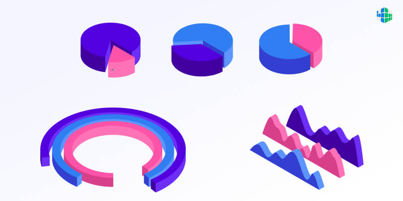
Types of infographics
A modern person needs to navigate a huge flow of information every day. Data visualization often helps to cope with this task – our brain perceives and processes images much faster than verbal information (speech and texts). One of the most popular ways to visualize information on the Web today is infographics. And understanding its essence and types will be useful to everyone, regardless of the field of interest.
What is an infographic
Despite the prevalence and widespread use of this type of visualization, there is no unambiguous understanding of the term “infographics”. Different scientists and designers put different meanings into the concept of infographics:
However, most definitions agree that infographics are a graphical form of presenting information that speeds up its perception.
In addition to the fact that different meanings are put into the term, infographics are often confused with related concepts, such as “information visualization” and “data visualization”, “statistical graphics”, “information design”, “information architecture”.
To understand the difference between infographics and related types of visualization, a comparison according to the criteria “creation”, “aesthetics” and “amount of data” will help [Iliinsky, Steele, 2011].
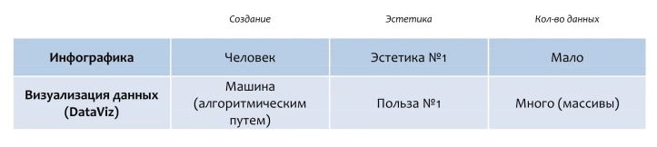
Thus, infographics is considered to be a graphical form of information presentation for quick knowledge acquisition, which is characterized by a high level of aesthetics, a small amount of data and is created mainly by hand.
A recognized expert in the field of visualization, Gene Zelazny, suggested removing all scales from it to determine the quality of a diagram: if the essence of what is depicted is clear even without them, then you have a good diagram. A similar method is applicable to infographics: mentally delete all text and numbers, and if the meaning is lost, then this is just an illustration of the text (Fig. 1), but if the remaining image is clear without words, then this is an infographic (Fig. 2).
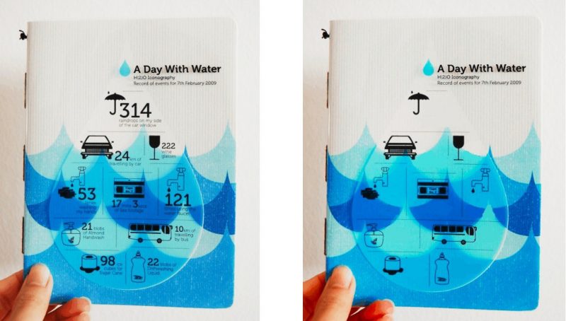
Figure 1. One day with water infographic. Without numbers and signatures, the meaning of the drawings is difficult to decipher. The images are merely illustrative of text inserts. Source: infographer.ru
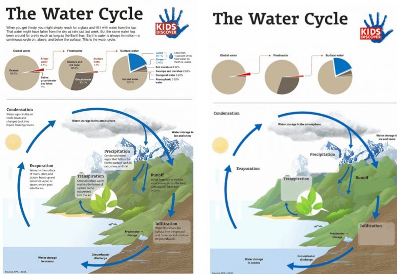
Figure 2. The Water Cycle infographic is clear without textual explanations. Source: infographer.ru
Infographics perform different functions depending on the scope:
- in marketing – increases customer awareness of the product, helps to choose the right service, tariff plan;
- in education – contributes to a comprehensive understanding of the subject, memorization of material in the form of vivid images;
- in science – used to organize and analyze large amounts of information, search for hidden patterns;
- in journalism – helps to argue a point of view, show social or political trends, reveal the essence of the described phenomenon.
It is known that a person best of all remembers emotionally charged information. Infographics are interesting, quickly perceived and remembered precisely for this reason: they combine aesthetics (emotions) and utility (facts).
Two approaches to rendering
There are two opposing approaches to information graphics, reflecting their nature and scope: exploratory and explanatory.
Research infographic
Research infographics is a selected and graphically organized array of information for analysis and searching for patterns. This type is more often used in a professional environment: the author collects, structures information and presents it in a graphic form convenient for self-analysis. An exploratory type of infographic contains more data and is more difficult to understand than an explanatory type.
Professor Edward Tufte, an investigative type of infographic, believes that “embellishments hurt content” and that “graphic junk makers think numbers and details are boring and just need to be spruced up with ornament.” He sees the quality standard for infographics in well-designed, detailed maps with multiple layers of data, and “graphic slag is more like a poster than a map.”
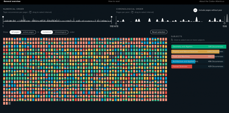
Figure 3. An example of Leonardo Da Vinci’s Codex Atlantic research type infographic. The codex-atlanticus.it project was created for the 500th anniversary of the death of a brilliant artist. The digitized pages of the manuscript can be studied by several indicators (year, depicted objects, subjects) and find trends and patterns that interest the viewer. The authors do not offer any specific conclusions, but present 1119 pages of the manuscript in a form convenient for research.
Explanatory infographic
The explanatory infographic presents the results of the information analysis carried out by the author, contains the patterns he found. The author has studied large amounts of data and shows his findings to the audience. Explanatory infographics are used in a non-professional environment and are usually understandable to an unprepared viewer.
World-famous graphic designer Nigel Holmes, proponent of an explanatory approach to infographics, says: “I have always been an advocate of light humor in infographics. It’s a way to befriend the reader/viewer/user by helping them relax when faced with a set of numbers or scientific concepts. I tried to make reading and understanding graphics an enjoyable process, not boring homework. Many scientists and data designers hate this approach.”
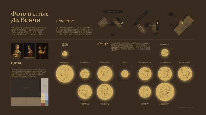
Figure 4. An example of an explanatory Da Vinci Photo infographic. The author shows the results of a study of 80 paintings by Leonardo: colors, lighting and the angle of images of models.
So, the first approach focuses on the usefulness and semantic richness of information graphics, the second – on expressiveness, originality of data presentation, metaphorical images and humor.
Compare two maps from the late 19th century. The first reflects an exploratory approach, the second an explanatory one.
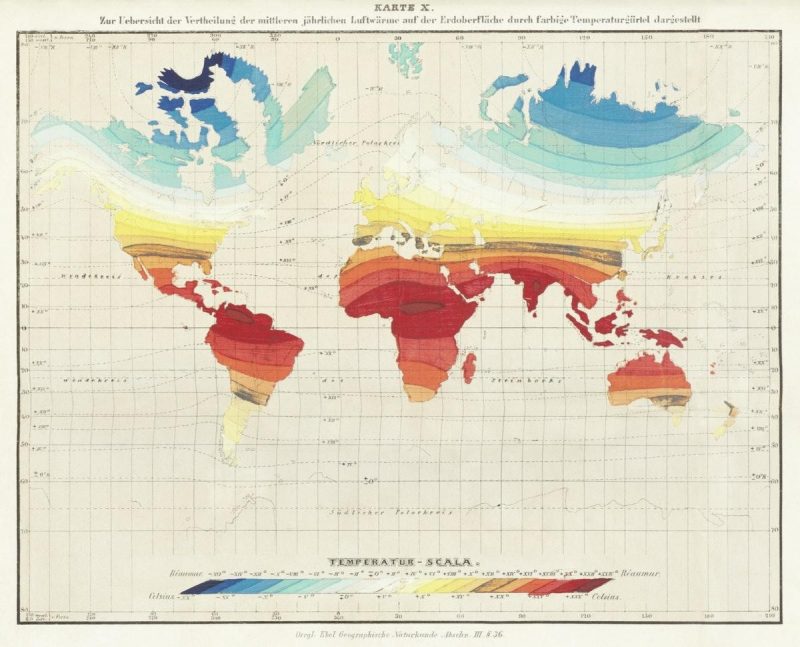
Map 1. Temperature scale on Wilhelm Ebel’s world map, 1850. Original from British Library. Digitally enhanced by rawpixel. CCO Public Domain
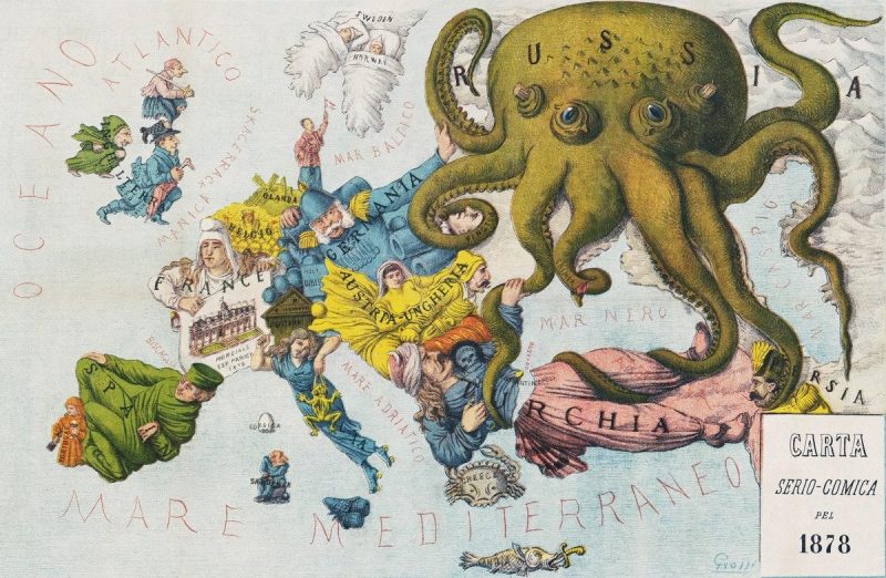
Map 2. An 1878 caricature of Europe by Augusto Grossi. Original from Library of Congress. Digitally enhanced by rawpixel. CCO Public Domain
However, in order to properly understand the nuances of infographics, it is important to know not only approaches to visualization, but also to understand the types of infographics.
Types of infographics
There are different classifications of infographics based on individual characteristics:
- By the nature of the visualization, the presentation of quantitative data and the presentation of qualitative data and relationships.
- By the principle of completeness – self-sufficient and complementary (requiring explanation).
- Based on the principle of presentation technology – static, dynamic (interactive) and video infographics.
The most universal version of the classification belongs to Dan Roam. Exploring visual thinking, he came to the conclusion that human vision is predictable: we always depict each type of information in a certain way.
Roem divided all the explanatory drawings into 6 categories: “portrait” (who / what?), “graph, diagram” (how much?), “map” (where?), “timeline” (when?), “ scheme” (why?) and “graphical equation” (why?)
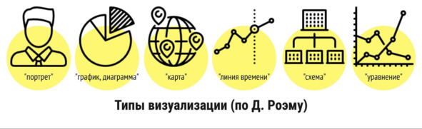
The listed types of visualization correspond to the types of speech “description”, “narration”, “reasoning”. Such a system allows you to convey any type of verbal information using graphics.
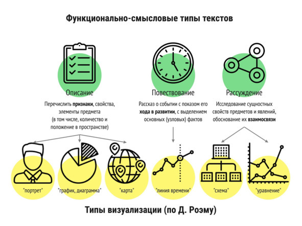
Let’s look at each type of infographic in more detail in connection with the corresponding type of speech.
Description
When we describe something, we talk about how it looks, how much or how little it is, and where it is located. Graphic analogues of description texts are infographics “portrait”, “graph, diagram” or “map”.
Portrait
The portrait focuses on answering the question “who?” or “what?”, depicting the important qualities of the object, its constituent parts. Such infographics help the viewer to imagine the appearance of an object, the character or habits of a person, the design of a mechanism, etc.
After studying this infographic, we can get an idea, for example, about the appearance of a cowboy, his activities, weapons, enemies:
0
By looking at this infographic, we can recognize the constituent elements of the Queen logo:
1
What can we understand from here?
2
“Hot facts about the sun. Temperature, surface, radiation…” Author: mhrybykk, Courtesy NASA/JPL-Caltech .
A popular type of infographic-portrait is comparison (vs, versus), when the most significant elements are shown in comparison with similar objects.
3
Move to the next view.
Graph / chart
This type of infographic depicts the number of objects, answering the questions “how many?”, “what part of the whole is?”, “how big?” etc. You can recognize such infographics by a large number of numbers, graphs, charts, comparisons of sizes or prices:
4
Professional career of modern youth, VTsIOM infographics
5
An infographic comparing the size of planets with fruits.
6
Media leisure for children in Russia.
Word cloud is a variation of this type of infographic. Word clouds depict the frequency, that is, the quantitative ratio, of words in a text or an array of texts:
7
1000 most frequent words of the Russian language.
The third subspecies of information description graphics is the map.
Map
The map reflects the location of objects in space. These are not only geographical maps, but also battle diagrams, plans for placing players on the field or dishes on the table, driving directions and other infographics that answer the question “where?”:
8
9
Map of the location of 18 thousand asteroids of the solar system. Author: TabletopWhale, Courtesy NASA/JPL-Caltech .
Thus, we have considered the types of infographics related to the descriptive type. It is followed by a narrative.
Narrative
When we talk about events, we always indicate the time (first – then, before – after, many years later, in December 1975, etc.) or the sequence of actions. The visual expression of this type of information is the time line.
Timeline
This type of infographic depicts the sequence of events over time, actions, stages. A characteristic feature of the time line (timeline) is the time scale or the numbering of stages. Usually the past is depicted on the left, the future on the right (in the direction of eye movement while reading texts), but sometimes the time line is depicted from top to bottom or in the form of a spiral:
0
Grammar: 12 tenses in English.
1
9 films by Quentin Tarantino on the timeline.
2
NOAA-N / National Oceanic & Atmospheric Administration (NOAA) satellite timetable (CC0 Public domain). At the top of the infographic we see the year scale from 1978 to 2002.
Finally, the narrative is followed by reasoning and the types of infographics inherent in it.
Reasoning
The purpose of reasoning texts is to show patterns, connections, the impact of events on each other, to convince the reader or listener that they are right with the help of strong arguments. In such texts, we are looking for answers to the questions “why does something happen?”, “How are phenomena related to each other?” We can find answers to the same questions in the infographic diagram and the graphical equation.
Scheme
This infographic depicts the cause-and-effect relationship of elements, hierarchical relationships in the form of a diagram, diagram or relationship map (mindmap, mental map). Infographics of this kind depict the structure or principle of operation of organizations and political systems, the arrangement of mechanisms, etc.:
3
An example of an infographic diagram – structures of different organizations in Manu Cornet’s humorous diagrams (CC BY-SA 3.0, commons.wikimedia.org).
4
An example of a diagram showing how different film genres relate to each other. We can see that drama (upper right) is connected to all other genres, and has the most connections to the crime genre.
5
Image: By Nuclear Regulatory Commission from US – Typical Pressurized-Water Reactor, Public Domain, commons.wikimedia.org. The scheme of a water-cooled nuclear reactor depicts the connection of its constituent parts, names them. The arrows show the movement of energy and help the viewer visualize how the device works. We see what happens at the beginning of the process (cause), and what effect it has (effect):
6
Mind Map Time Management by jean-louis Zimmermann, www.flickr.com
Graphical equation
A graphical equation is an information graphic depicting the relationship of phenomena, processes, and actions. Most often, graphs with variable indicators are used for this – a change in one parameter causes a change in others.
Research infographics of this type help to find a connection between phenomena that is difficult to detect without visualization: the author collects data of different parameters (time, income level, success, life satisfaction, etc.) and looks for those whose changes in the graph will coincide ( rising or falling):
7
For example, the dependence of the level of health on the level of income of the population, proved using a graph with variable indicators by the authors of the project www.gapminder.org .
The “Dollar Street” project is another striking example of an interactive “graphical equation” infographic. It links income levels to dozens of different measures of people around the world. After studying the visual material, you can find or refute the correlation of indicators:
8
A variation of the graphical equation can be considered a decision-making infographic, in which several variables and the final point depend on the choice of the viewer:
9
Conclusion
Visualizing large amounts of information helps us to understand and structure them, because images (especially those that evoke emotions) are perceived faster than texts.
All infographics are divided into research, the purpose of which is to search for hidden patterns, and explanatory, in which the author shows his discoveries.
There are six types of infographics depending on the type of information they convey to viewers: infographics-portrait, graphs/diagrams, and maps convey descriptive information; actions and processes are depicted as a time line; the connection of elements is shown using diagrams and graphical equations.
Infographics can be one of six types or combine several to present an object from different angles, depending on the goals of the author. But no matter which option you personally choose, you can be sure that with the proper approach and certain practice, you will learn to influence the viewer exactly as you need.
We wish you good luck and success in your new projects!
Author: Alexey Demin